New technology has shown us how to approach content layout in a completely different way. Specifically I'm talking about heat maps and eye-tracking studies that demonstrate how people actually use web content.
They tell us that people read content differently when on the web versus on print. Where people will generally read from top to bottom on paper, readers online will instead follow an “F pattern.”
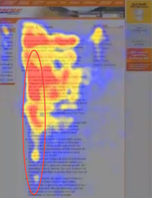
What is the F pattern?
Let’s say you find yourself on a particular sales page, here’s how your eyes begin to process the information presented to you:
- First, you will read across the full length of the page—from left to right.
- Next, you will probably bring your eyes back to the left side of the page and give the vertical length of the page a quick scan and again, read from left to right.
- Finally, your eyes will skim through the rest of the page going down.
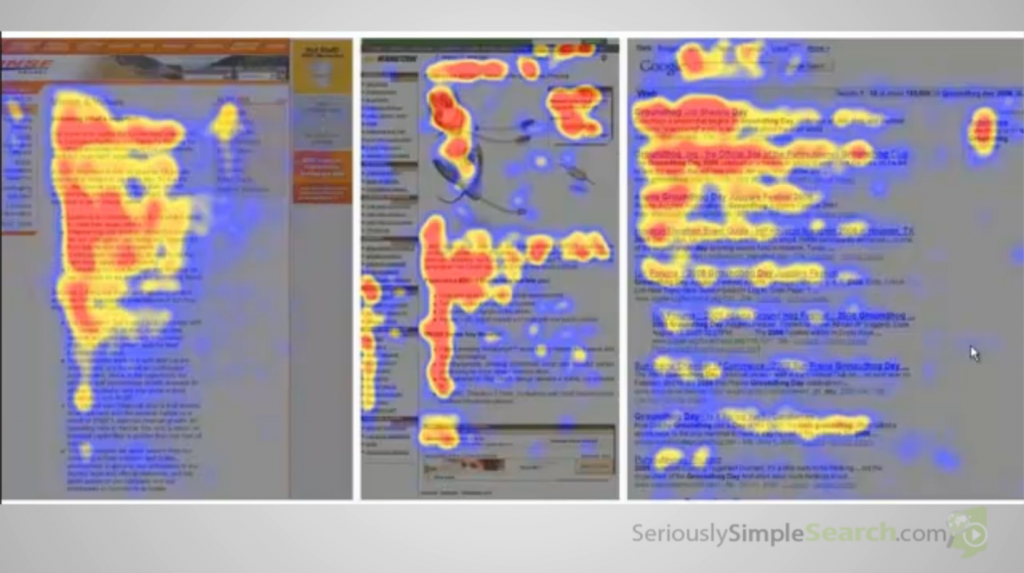
As you can see on the image above, audience eyes will scan through the page following a pattern that looks kinda like an “F.”
But What Does This Really Tell You About How To Maximize Your Audience’s Attention And Time On Page?
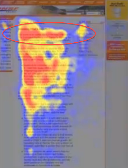
- There are 3 main scan lines where readers focus their attention on, based on the F pattern.
- Most readers get turned off with long blocks of text. (These are like “walls of text.”)
- It only takes seconds for web visitors to decide whether or not they like your content enough to explore your website or to bounce off your site.
Knowing these, here’s how you can maximize use of the F pattern to engage and capture audience attention:
- Use the top bar of the F pattern to give important information that your readers will want and need. These include—
- Contact information (if that’s the purpose of the page)
- A good headline that tells them what your content is all about and what's in it for them
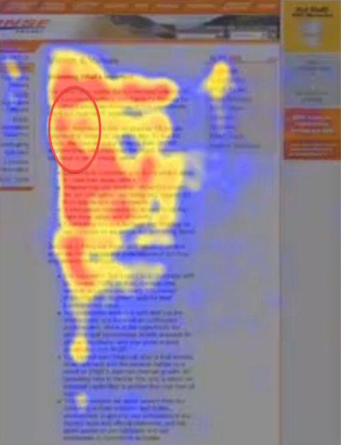
- Along the short horizontal part of the F pattern, I would suggest that’s where you add compelling subheading.
- Provide supporting text that reinforces your headline.
- Use this spot to add copy that will further entice or engage your audience.
- Ensure that the vertical length of your F pattern features content divided up into bite-sized pieces—
- Use bullets, numbers and block text to break up content.
- Use headlines in bold to draw attention to headlines.
While the F pattern is a common scanning pattern, remember that there will always be exceptions to the rule, which is why I would recommend that you always test what you think will work… just to be sure it does.
For instance, if you’re considering putting your call to action on top versus the bottom of the page, the only way to really be able to tell what will get the most conversions is to test it. We recommend using Visual Website Optimizer as a way to simplify the testing process.
If you have questions about the “F Pattern” or other content marketing tips, please leave a comment below. As always, if you found this post helpful or interesting, please share, like, plus and tweet!
– Mercer
Our SlideShare Slides:
Our Video Recap:
Images Used With Permission, Courtesy of “F-Shaped Pattern For Reading Web Content” by Jakob Nielsen on April 17, 2006