Split testing is a very useful tool. But to get meaningful results, you have to know what to test for and be open to learn from the results. Here are some split testing ideas you can run to improve your landing page and get real and actionable results.
‘WHERE’ Depends On ‘WHAT’
Something as simple as where you place your Call-To-Action (CTA) can make a huge difference when it comes to results. The goal here is to decrease friction and increase the possibility of your readers responding positively to your CTA.
Normally, CTAs are placed above the fold for better visibility and access. But here’s why it’s always important to test…
In this example from Kissmetrics, it shows a split test between a CTA located below the fold vs. above the fold. And it reveals that, surprisingly, the assumption to place CTA above the fold isn’t always the most effective…
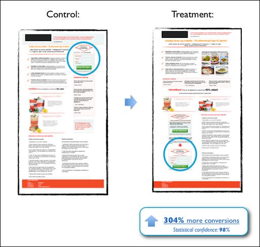
In this test, moving the CTA below the fold prompted a significant increase in conversions. Specific to this page, it’s likely because of the complexity of what the site offers–which requires readers to read through content thoroughly before opting in.
Here’s a tip…
Depending on what you’re selling and what you want your users to commit to, test different placements for your CTA. Check whether it would work best at the top, the middle or at the bottom of the page or even a combination of both. You never know when someone scrolls all the way down to the bottom of your page and then decides to take action… have a button nearby so they can!
The offer has to give value first–and if they see the form right away, they know you want them to give you information. In a way, it’s like a salesman asking for the sale before the pitch ever starts. It's important to think about the traffic source in these cases too.
If the traffic source is an email that preps them for the offer then the optin form would be expected and can help improve results if it's above the fold. If the traffic is from a display ad, then the expectations aren't as defined and the landing page should build a bit of value before tipping it's hand as to what action is required to move to the next step.
Pushing Buttons
Something as simple as the copy on your button can improve your landing page performance.
It’s obvious that you have to keep it simple. Usually, the real question becomes whether or not you have to emphasize what they will get versus what they have to do, as seen in this A/B test run by ContentVerve. In their test, they wanted to see how effective benefit driven versus action oriented copy is.
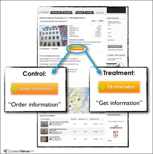
Their test revealed that focusing on what users get converted over 30% of their users.
Here’s a tip…
One word can deliver the results you need. Remember that the copy on your button might be all that stands between a bounce and your desired action, so it pays to test which word will work best.
Stories & Summaries
Many landing pages use long-form copy, but there is a case to be made on the effectiveness of using shorter summaries too.
Here are a couple of examples Kissmetrics discussed…
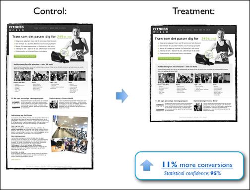
In this example, where they're trying to get readers to join a gym membership, short-form copy managed to convert 11% more than its longer version.
Despite the reported shortening attention spans of Internet users however, this next example, which offers a home energy audit, shows the long form copy managed to convert a lot more.
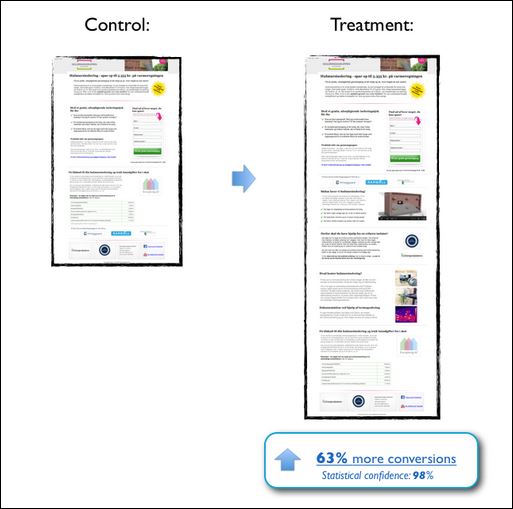
The complexity of your offer is a huge factor in the success of your conversions.
In the first example, where the page is simply offering a gym membership, there was no need to go on and on and on. Gym memberships are a pretty basic product. Chances are most people aren't looking for a ton of detail about them. So brief, easy to read copy was more effective.
On the flipside, something as complicated as a home energy audit, which requires a little more explanation in terms of what it is and what you can get from it, benefited more the longer copy since they needed to explain all the in's and out's.
Here’s a tip:
There are no definites when it comes to split tests–that’s the reason why you have to test in the first place. Unsure whether or not you should use short of long-form copy? Test!
Focus Is Everything
What's the purpose of your landing page? Is it focused on getting your visitors to take the action you want?
Take a look at this case study from the Visual Website Optimizer blog…
In the original page design, images, icons and other visual elements were part of the main concept.
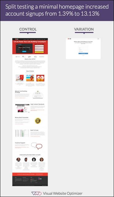

You would think that this page would be get plenty of engagement and lead to more conversions. But often, they just lead to distraction!
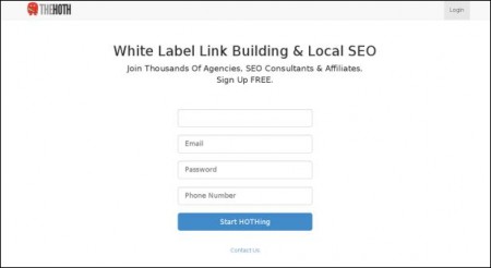
In fact, when the company tested against a minimal, focused version, account signups went up from 1.39% to 13.13%.
Here’s a tip:
Build your landing page for one purpose and one purpose only. To get the desired action you want… that's it. Adding anything else that doesn't aid the user to achieve that action could just end up being a distraction.
Prove It!
Another standard when it comes to landing pages is social proof. You have to have it, they say. And in most cases, they’d be right.
Most doesn’t mean always, though.
In the case of this test featured in this DIYthemes post, it proves that there will always be exceptions to the rule.
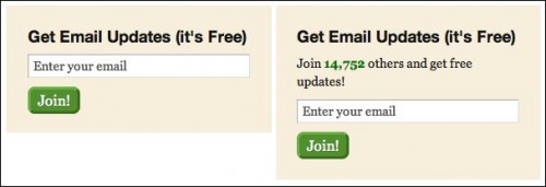
The obvious assumption would be that adding social proof = higher conversions, right? Which means the image on the right should’ve been more effective.
But in the case of this test, it wasn't.
Why?
It could've been that 14,752 wasn’t exactly impressive number. It could've been that it was so specific that it wasn't trusted as a “real” number and was simply made-up. Sometimes, it’s better to have no proof at all.
Here’s a tip:
Instead of using a number to prove your credibility online, why not just use social proof as a way to prove to your users that the personality behind the blog or product can be trusted.
Prove that you are a real person by adding your Google+ profile instead of your Facebook or Twitter follower statistics, or maybe add a snippet of your best reviews online.
Here’s The Bottom Line…
General assumptions as to what you should be doing on your landing pages to get them to convert are simply that, assumptions. The reason why you have to test is because results can vary depending on your product and your audience.
If you have any questions, be sure to leave me a message in the comment box below. And if you found this post useful, be sure to hit those share buttons!
– Mercer
