Have you ever tried using the psychology of color to improve your conversions?
In Internet marketing, colors play a big factor into how your target audience responds to your message. Something as simple as choosing blue over red or creating color contrasts on your landing page can go a long way towards raising your metrics.
Let’s start with the basics…
I’m not a designer. And when it comes to the colors on my website, I have to depend on a color wheel to let me know which colors go with what.
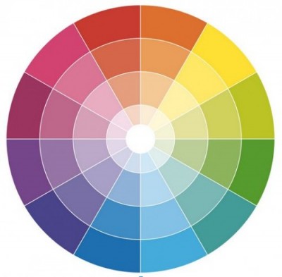
Here’s my secret tip…the color opposite each hue on the wheel creates a complementary contrast to one another, making it easier to pick which ones you should use.
So for instance, if you decide you want to create a website that features yellow as the main color, you can use indigo as a complementary hue.
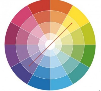
(PRO TIP: Use Adobe's Color Wheel… it's super helpful if you're like me and can't tell what's supposed to match what. 🙂 )
Of course, choosing a color isn’t just about what looks good on the screen.
Your color choices will draw some kind of emotion from your users simply because of the implications behind your chosen hues. This is even more important given that the sensory experience is limited to a largely visual platform online.
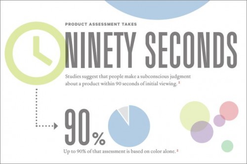
In an infographic made by Kissmetrics, they talked about how 90% of users’ first impression about a product or brand is made within 90 seconds of seeing it.
How do you make the most out of those 90 seconds? By making a great and lasting impression using color psychology.
Here are some tips…
BLUE
Blue is known to imply trust and stability.
According to literature, it is a color that brings to mind calmness, security, order. Which is why some of the biggest brands around the world use blue to impart this sense of trustworthiness.
Take PayPal, which is the world’s most popular online payment system.

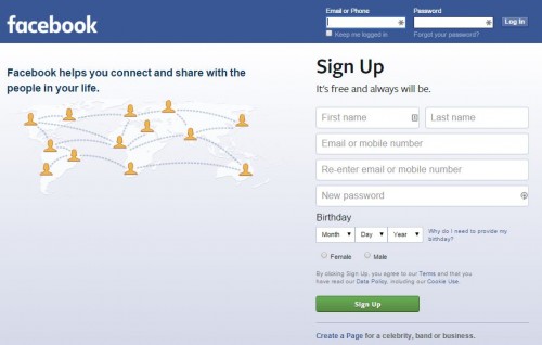
…Or Facebook–the largest social network today.
GREEN
Use Green to talk about the environment or outdoor products.
If your product has anything to do with nature, the environment, adventure, the outdoors, the easiest way to establish your credibility in this industry is by using the color green.
A rising new organic cosmetic brand, Kora Cosmetics, uses a gentle shade of green to establish their authority in the market.
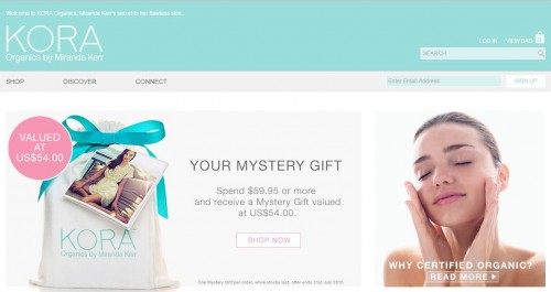 Notice as well that the softness of the shades that they chose to use. Being a cosmetic brand, the color, apart from identifying with the concept of nature, has be gentle and soothing, which is likely why they went with a milder, sea-foam green as opposed to a bolder shade.
Another example would be The Nature Conservancy website, which features a richer shade of green to evoke their organization’s mission.

ORANGE
Orange is interesting since it manages to evoke fun, but also imply a sense of urgency.
While it’s versatility makes it a great choice for a website that wants to show personality, it must be used sparingly to remain tasteful.
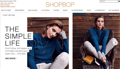
Check out how shopping site Shopbop uses the color orange following a very minimalist look.
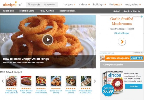
Or see how this cooking and recipe website, Allrecipes.com makes the most out of the color orange.
BLACK
Black is known for imparting a sense of luxury and value.
Sites that use black as a major color in their sites want to evoke a sense of elegance, exclusivity and high-value.
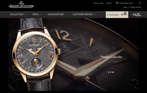
Vogue Magazine, the most prestigious women’s fashion publication’s website, is done in a beautiful black and white palette…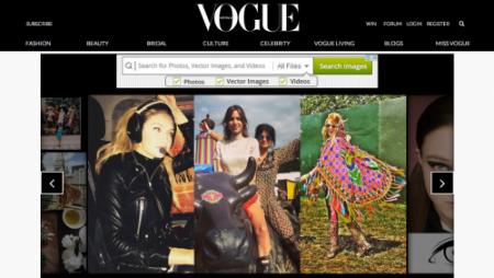
…as does the luxury watch brand, Jaeger-LeCoultre.
PURPLE
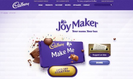
Purple implies free-spiritedness, creativity, and generosity.
Purple themed websites are usually chosen by creative agencies or brands that want to highlight their positive image, stimulating imagination.
Here’s how Cadbury makes full use of this color…
What Women Want
Women, according to an article by Neil Patel, are attracted to a specific palette of hues…
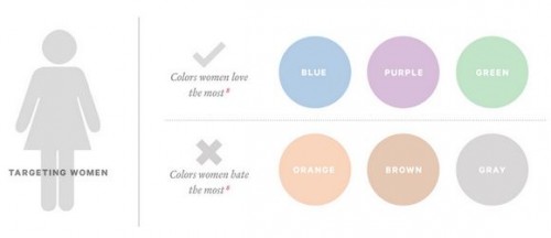
In terms of catching your desired target market’s eye, you would want to leverage on their color preferences to capture their attention.
Here’s a tip:
If your primary target audience is female, then the option to choose blue, purple, and green would be obvious.
But what if you don’t want to alienate your male target audience? Be sure to use your feminine colors as accents instead of being the primary site color. Keep your background neutral so that you have more freedom to mix and match appropriate colors.
On The Flipside…
If women have their color preference, so do men…
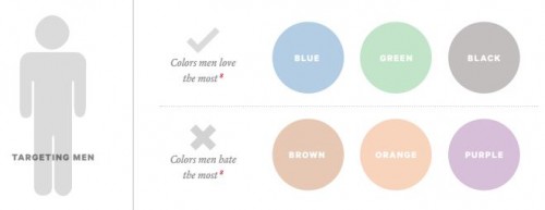
If you want to attract men to your site and want them to stick around long enough so you can make your pitch, use blue, green and black.
Here’s a tip:
If you’re marketing to males, but have women as a secondary audience, you might want to take advantage of their common colors, such as blue and green.
But take note that male preferences for these particular colors lean towards bolder, richer shades; as opposed to women who might appreciate the same hue but in a softer shade.
Final Word…
Color is one of the most subjective elements you can use on a website. These tips and guidelines, while useful, will always have exceptions. And to make it all the more effective, learning how colors affect conversion rates should always be done in tandem with knowing and understanding your target audience.
If you have any questions, feel free to leave me a message in the comment section below. And if you found this post useful, be sure to hit those share buttons!
– Mercer

