
Could your website be scaring away customers? You’d be surprised how one little change can make your sales funnels more appealing (and improve those conversions)!
I covered this exact question during a recent talk I gave at the Performance Marketing Summit in Salt Lake City, Utah, and figured I’d share a summary of the answers with you here.
Let’s start!
Call To Action
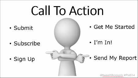
A call to action is essentially added for the benefit of the site owner, but you have to explain what’s in it for the person who is clicking as well.
Make it easier for your audience to decide that they want to click on your offer by making it action oriented and benefit driven.
Another thing that may be scaring your customers is a lack of Focus.
Focus
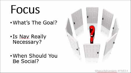
Your audience doesn’t need a dozen different things to click on. Remember this rule: “One Page, One Purpose.”
Things like sliders on a homepage are one of the worst elements to have. You might think it’s a great way to cram more information on your website, but they tend to scatter focus and be very distracting.
Make it easy for them to find the right option and to take action on that option. Remember, the more choices your customers have to make, the scarier it is for them.
At the end of the day, it comes down to matching your customers Expectations.
Expectations
Let’s do an experiment. Take a look at this ad:
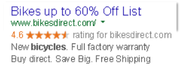
If you were to click on this ad, what would you expect to happen?
Most likely, you’d expect to see a page talking about bikes being up to 60% off list, right?
What if you saw a page like this instead?
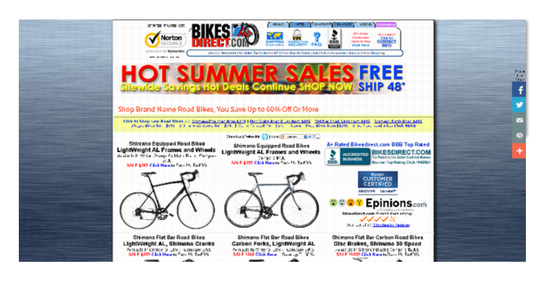
At first glance, you might notice the headline “Hot Summer Sales” and then the fact that there are so many different items to click on. This page clearly violates the “One Page, One Purpose” rule and doesn’t do the greatest job of matching expectations. (BTW, remember that “60% Off” messaging you expected to find? It’s there… but it’s barely noticeable.)
The better job you do “connecting the dots” between what your customer expects and what you deliver to them, the higher your conversions will climb.
Speaking of conversions, are you keeping an eye on Mobile?
Mobile
You’ve probably already heard you should keep an eye out for the rise of mobile. It’s been happening for years, but 2015 WILL BE THE BREAKOUT YEAR for mobile.
Why?
Because 2015 is the year that mobile payments will take hold. Apple has finally decided to join Google, Paypal, and others with a mobile payments platform. They got good timing because in 2015 all retailers in the US will be forced to upgrade their equipment to accept payments from smartphones.
It’s the perfect storm and you’ll see a massive shift to mobile payments in brick & mortar stores. That’s absolutely going to impact online payments as well. There will be lots of options for “one-click” checkouts and your mobile carts better be ready.
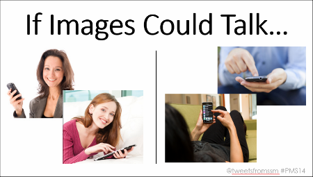
Finally, let’s talk about Images & Authority.
Images & Authority
The images that are on your sales pages (or the ones you use in your VSL) should speak for themselves. Actually, that’s great way to test your images. For example, if you want to communicate “our app is easy to use”, would you rather see the images on the left or on the right? (Hint: The images on the right are more congruent with your desired message and will most likely lead to higher conversions.)
Images can also help communicate that your site is safe, secure, and trusted. In essence, they can communicate authority. Use authority badges on your site. Build your credibility online by addressing concerns from your audience (remember to match those expectations).
So there you have it. Some simple steps you can take today to help make sure your website remains welcoming (instead of potentially scaring customers away).
And on that note, remember there is no such thing as a “cookie cutter shortcut” to a more effective site. You have to split-test (using tools like VWO) to make sure your changes are making an impact.
Was this post helpful? Have a question? Please leave a comment below…
– Mercer
Our SlideShare Slides: